Data & Methods
Data for the counties as well as for the National Priorities List (NPL) Superfund Sites, were both obtained from ArcGIS. County cancer rates data in the form of an Excel document, was obtained from the State Cancer Profiles website.
The counties layer contained a lot of information about the county’s population, as well as the square mileage that it encompasses. Due to the unavailability of localized cancer data, the objective changed to focus on counties with smaller areas. the square miles column in the attribute table was sorted ascending, to arrange the counties by the smallest in square miles. Along with the NPL site layer, looking at these layers simultaneously helped determine the chosen study areas, to minimize the area that could be affected by the NPL site, thus making it more localized. A total of 24 counties that contained 1 or more NPL sites were selected, with a total of 99 NPL sites. Also 5 counties that did not contain NPL sites were selected as control counties.
The counties were isolated with the select by attribute feature, then the data was exported into a new shape file of just the selected features. The population information in the counties attribute table, was for the years 2010 and 2012. The 2012 population was chosen due to the date range of the county cancer data, which was a 5-year period from 2010 to 2014. Because of the range in the county sizes from 1.99 to 3814.77 square miles and the population size not correlating (i.e. the smallest square mile was not also the smallest population). So, to get a more accurate representation of the county, the population per square mile was used to be normalized with the cancer rates.
The original excel table of county cancer rates, included all of the counties in the US, so there was a lot of unneeded information. A new excel table was created for the county cancer rates, as it was to be joined with the selected counties, to simplify the process by getting rid of the unnecessary counties and because the county names and state names were joined in the same cell for the cancer data. The new excel file also included a column of the FID# of the counties, to simplify joining the cancer rates to the county attribute table.
The information provided from the cancer rates table includes all types of cancer, for all races/ethnicities, both sexes and all age ranges, for the last 5-year average. The data includes the “age adjusted incidence rate cases per 100,000”, the average annual count, recent trend (stable, rising, falling) and recent 5-year trend (the percentage increasing or decreasing). The average annual count (of cancer incidence in the 5-year period) was chosen to be normalized with the population per square mile instead of the incidence rate because of the uncertainty of the per 100,000 cases factor.
The normalization of with the population per square mile with the average annual count was broken into 10 classes with natural breaks and given a color ramp from red to green. Dark red representing the highest, and dark green representing the lowest rate.
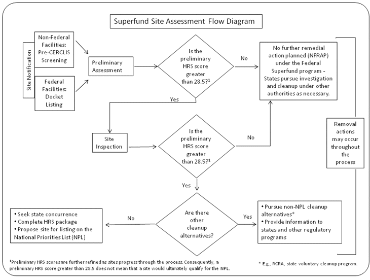
The superfund sites layer from ArcGIS was then clipped with the selected counties to remove unnecessary sites. The “Site Score” determined by the EPA was provided in the attribute table. The site score is a numerically based screening system that uses information from investigations to assess the relative potential of sites to pose a threat to human health or the environment. After each stage of the investigation if the sites score stays above 28.5 it continues to the next stage of the investigation eventually making its way onto the list. (Fig 1) The site score is depicted as graduated symbols, along with the date the site was proposed on the map layouts.
To have a better understanding of the patterns that were being noticed along with a few anomalies, further investigation of the areas was required. Such as the background of the area along with the types of toxins effecting the environment, and the types of cancer those toxins can cause.
Fig 1.